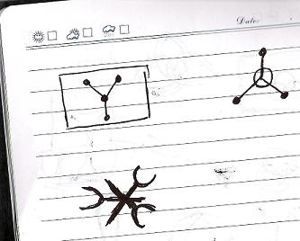
 We have a flag pole, left here by one of the previous occupiers, and we've been discussing what design we should use for the national flag. The legislative system in Compoundia is still a little liquid, decisions tend to be made in (occasionally smokey) back rooms and then implemented on the civilian populace (median age: 5) with little democratic process. So it seems in line to open the floor to foreign delegates for commentary and a sense of national transparency. (But don't go poking around our naval disclosure.)
These are all little doodles (and obviously only vague ideas) for the main symbology. I etched them while fuming about how crap the monster reveal was as we watched the second season of lost on DVD. Compoundia is displeased by your foreign plots!
I like the item on the left of the upper image, as it reminds me somehow of the flux capacitor, which has a long and secret history here. There's something pleasing about the forked image, but it looks a little too like an American football official informing the crowd it's good while under odd lighting.
The top two in the below image are obviously variations of the same, but I kind of prefer the one on the right, even if it seems a little sciencey (The technology sector is currently a large part of our GDP). I considered putting dots on the inner ring to represent the heirs apparent, in the style of the American flag's stars-for-states, but how to divide them became a problem. The bottom one actually just makes me think of a villianous corporation or super-consortium. Or possibly somehow nautical.
Thoughts from home or abroad? Colour scheme is also up in the air as far as I know.
